

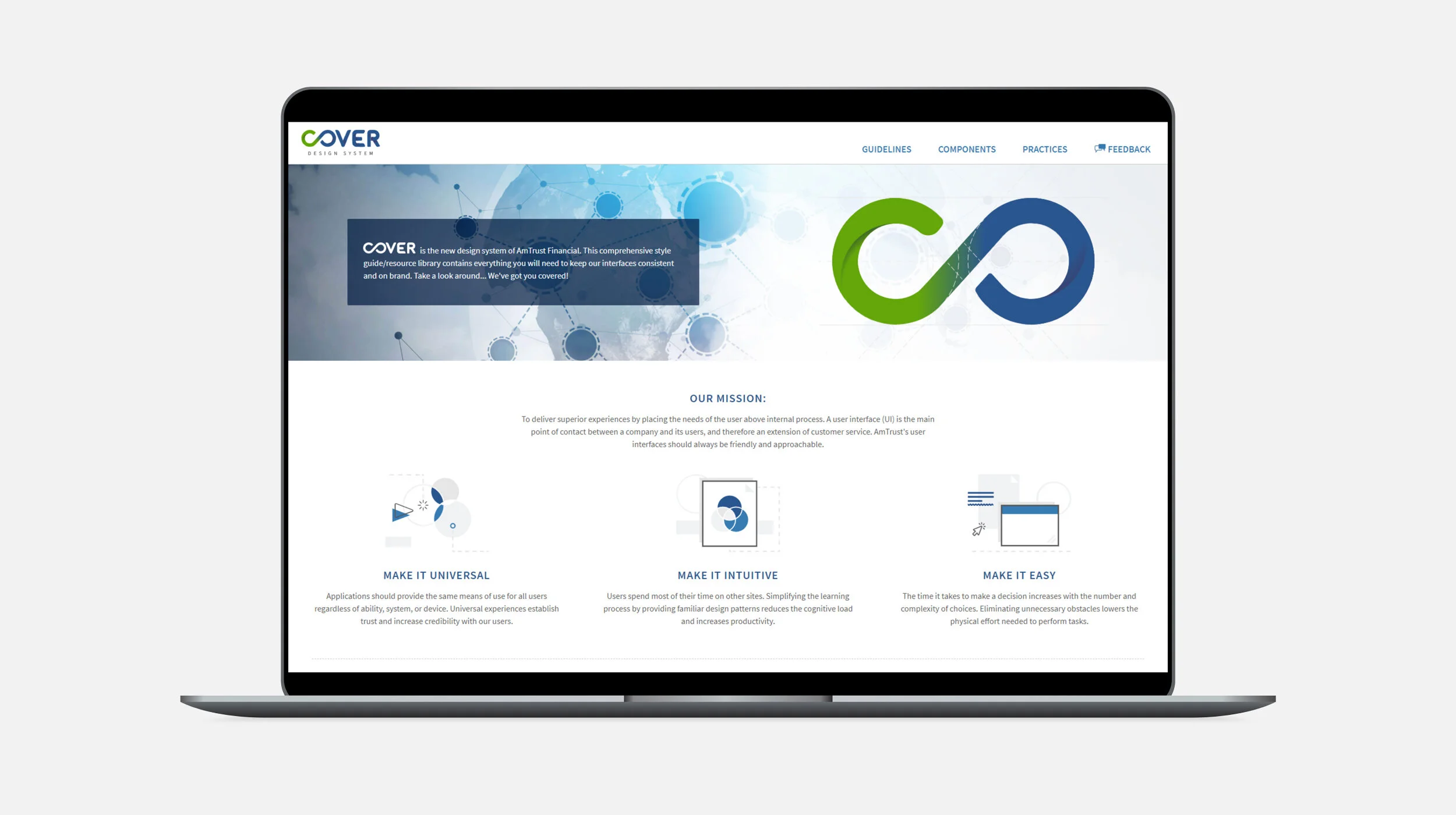
Cover Design System - One system to rule them all.
Cover is AFSI’s Design System.
Project + My Role: AFSI’s internal workflows were severely outdated and in need of a design facelift. As part of a front-end team building out several applications, I worked to craft a collection of guidelines, principles, and assets to instill universal consistency amongst all AFSI apps.
Execution: These elements include style, content, and design guidelines, as well as UI/Component libraries. Further still, I carefully crafted dozens of illustrations for user interactions, components, best practices, and rules.
Solutions: As AFSI’s design system was being created in tandem with other internal apps, Cover evolved into a user-friendly system adopted across the application board. Cover is constantly evolving, and we focus on adding essential elements as they are proposed through the design/development process. My team and I are also currently working on updates to these standards, which include a potential dark theme or theme switcher for easier readability.


Content Design Principles
Non-aesthetic elements that describe Cover language, principles and objectives.

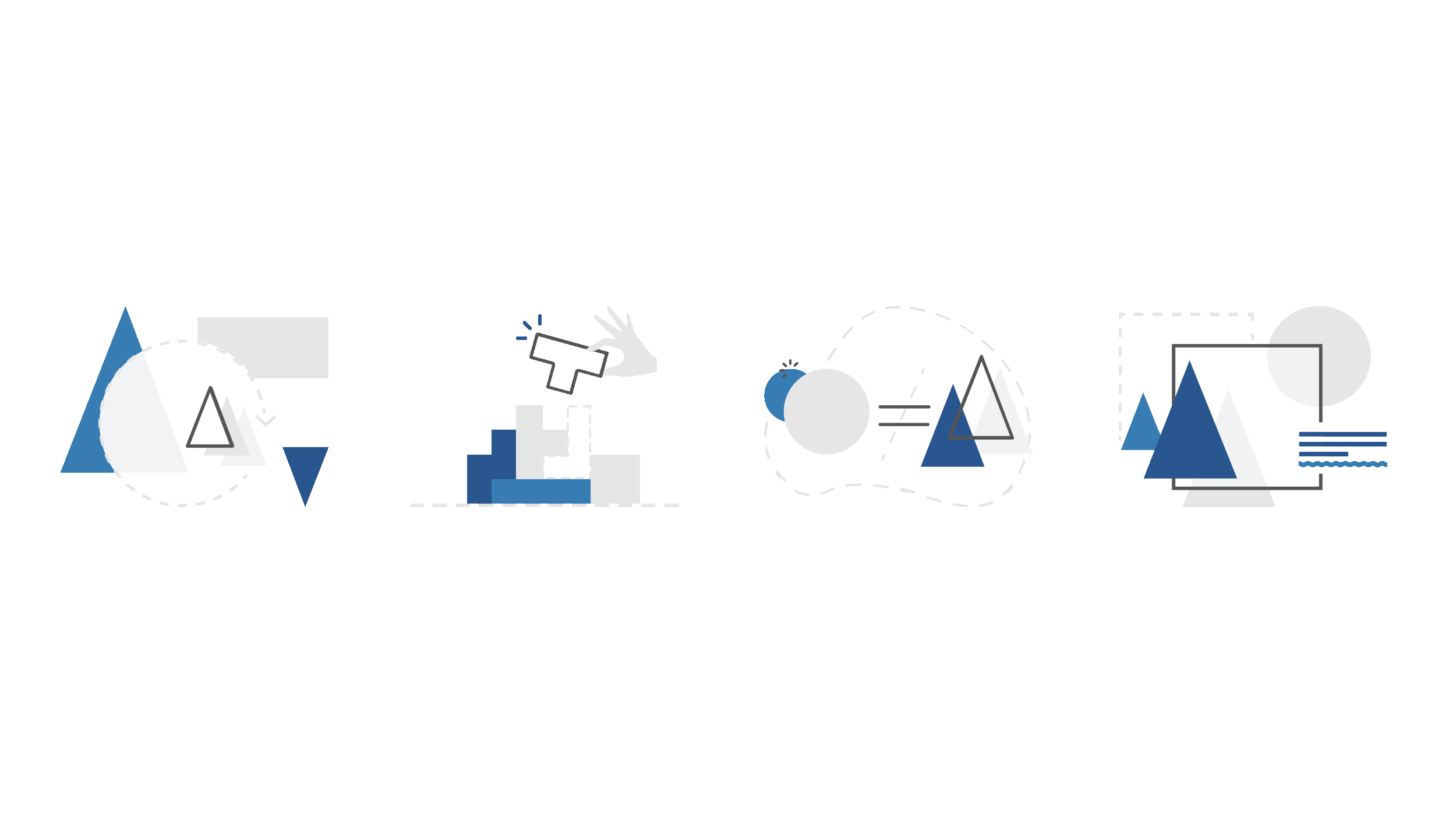
Accessibility illustration
One of many thoughtfully crafted illustrative compositions explaining color and accessibility. While it is important to the structure and design of AmTrust sites and applications, color alone should never convey information. When choosing colors, we considered users who are colorblind or have low vision. Cover’s palettes comply with the latest (WCAG) Web Content Accessibility Guidelines.


Consistency, Clarity, Efficiency and Aesthetic.
Applications should provide the same means of use for all users, regardless of ability, system, or device. Using WCAG, research, and testing, my team successfully built a working design system. By eliminating all ambiguity, Cover has streamlined and optimized AFSI user workflows.


Illustrations with a purpose, showing micro interactions for use case examples.
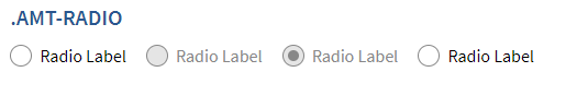


Micro-interactions
Clean and subtle interactions for clickable elements.